Choosing the right colors for a crochet blanket isn’t just about personal preference, it’s a design decision that affects how a room feels, how much the blanket gets used, and how well it holds up visually over time. A poorly planned palette can clash with existing decor or fade into the background, while a thoughtful combination ties a space together and adds warmth, texture, and visual interest. Whether working with scrap yarn or investing in a full project’s worth of skeins, understanding color theory basics and current design trends helps crafters create blankets that look intentional and polished. This guide walks through twelve proven palettes, from classic neutrals to bold modern combos, with practical advice on matching colors to rooms, seasons, and skill levels.
Table of Contents
ToggleKey Takeaways
- Color schemes for crochet blankets set the mood of a room and impact how frequently the blanket gets used, making thoughtful palette selection as important as stitch choice.
- Cool colors like blue and green promote calm in bedrooms, while warm reds and yellows energize living spaces, and neutrals provide visual rest and adapt to changing decor trends.
- Simple stitch patterns benefit from bold color play to add visual interest, while intricate stitches like cables shine in monochromatic or low-contrast schemes where texture takes center stage.
- Timeless two-color combinations such as navy and white, black and cream, and gray and mustard deliver lasting appeal across design styles and seasonal changes.
- Match color palettes to room function and lighting conditions—pull accent colors from existing furniture and artwork in living rooms, and choose calming blues and greens for bedrooms.
- Seasonal rotation and context-aware planning ensure crochet blankets see daily use rather than storage; lighter palettes suit spring and summer, while deeper tones embrace fall and winter warmth.
Why Color Choice Matters in Crochet Blanket Design
Color is the first thing people notice about a handmade blanket. Before they register the stitch pattern or texture, the palette sets the mood. A well-chosen scheme can make a small room feel larger, a cold space feel cozier, or a plain sofa look thoughtfully styled.
Color psychology plays a role in how a blanket functions in daily life. Cool blues and greens promote calm, making them ideal for bedrooms. Warm reds, oranges, and yellows energize living areas. Neutrals provide visual rest and pair easily with changing decor trends.
Yarn weight and fiber affect how colors appear in finished work. Wool and cotton absorb dye differently, so identical color codes can look distinct across fiber types. Bulky yarn shows color blocks more boldly, while fingering weight allows for intricate gradients and subtle shifts. Testing gauge swatches in natural and artificial light prevents surprises after investing hours into a project.
Pattern complexity should influence palette choices. Intricate stitches like cables or popcorn clusters shine in monochromatic or low-contrast schemes, where texture takes center stage. Simple granny squares or single crochet work benefit from bolder color play to add visual interest. Matching color complexity to stitch complexity keeps the finished blanket balanced.
Finally, practicality matters. Lighter colors show stains and dirt more readily, making them less ideal for high-traffic areas or homes with kids and pets. Darker shades may fade faster in direct sunlight. Mid-tone blends and variegated yarns offer forgiving middle ground for blankets meant for everyday use.
Classic Color Schemes That Never Go Out of Style
Certain palettes have staying power because they’re rooted in design fundamentals rather than fleeting trends. These combinations work across decorating styles, from farmhouse to mid-century modern.
Monochromatic and Neutral Palettes
All-white or cream blankets remain popular for their versatility and ability to showcase complex stitch patterns. Natural fibers like undyed wool or organic cotton highlight texture without competing colors. These work especially well in minimalist or Scandinavian-inspired spaces.
Grayscale gradients, ranging from charcoal through dove gray to off-white, add depth without introducing color. Alternating light and dark rows creates visual movement. This palette suits contemporary interiors and pairs with virtually any accent color in throw pillows or artwork.
Beige, taupe, and oatmeal tones bring warmth without bold saturation. These earth-tones complement wood furniture, leather upholstery, and natural textiles. Mixing matte and slightly shiny yarns in the same neutral family adds subtle dimension, similar to how various craft techniques layer texture for visual interest.
Single-color ombré effects transition from pale to saturated within one hue. Starting with blush pink and deepening to burgundy, or moving from sky blue through navy, creates a sophisticated gradient. This approach requires planning stripe widths carefully, narrow transitions feel modern, while wide color blocks read as more traditional.
Timeless Two-Color Combinations
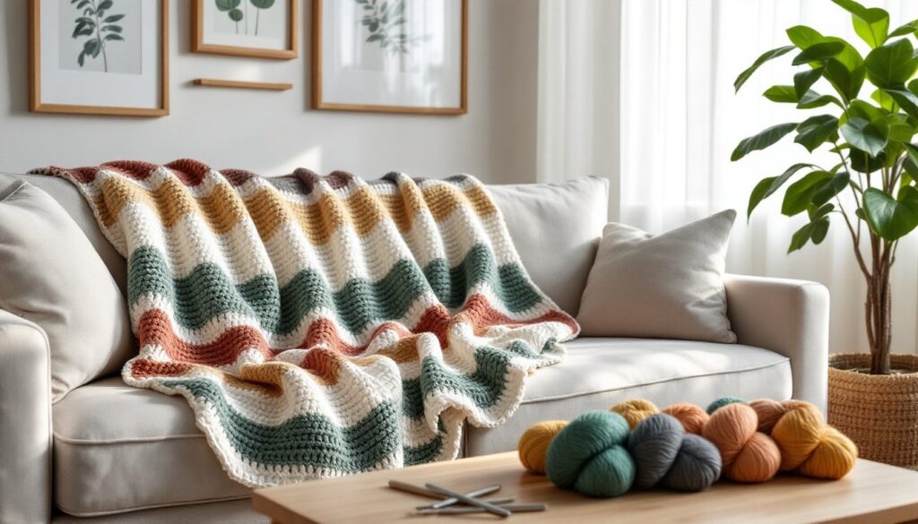
Navy and white delivers crisp, nautical appeal. Stripes in varying widths prevent the pattern from feeling too literal. This combo works year-round and complements both coastal and classic interiors.
Black and cream offers high contrast without harshness. The combination feels graphic and modern in geometric patterns, or soft and vintage in floral motifs. Charcoal can substitute for true black to slightly reduce contrast.
Gray and mustard became a go-to pairing in the 2010s and hasn’t lost relevance. The cool neutral balances the warm accent, creating visual tension that keeps the eye engaged. Swap mustard for rust or burnt orange for seasonal variation.
Denim blue and natural linen tones evoke casual, lived-in comfort. This low-contrast duo suits farmhouse and cottage aesthetics. The colors age well together, developing character rather than looking dated as trends shift.
Trending Color Palettes for Modern Homes
Design trends in 2026 favor earthy complexity and unexpected pops of saturated color. These palettes reflect current interior design movements while remaining grounded enough to age gracefully.
Terracotta, sage, and cream brings the modern organic trend into crochet. The warm clay tone grounds the muted green, while cream provides breathing room. This trio works in equal proportions or with cream as the dominant neutral and the other two as accents. It’s particularly effective in DIY home projects that emphasize natural materials.
Deep teal, blush, and charcoal balances moody and soft. The jewel-tone teal acts as the anchor, blush adds approachability, and charcoal provides structure. Use charcoal for borders or grounding stripes to prevent the palette from feeling too delicate.
Ochre, forest green, and brick red channels 1970s warmth without feeling retro. These saturated earth tones work in chunky yarn for a cozy, textured result. The palette pairs well with wood tones and vintage furniture.
Lavender, butter yellow, and soft gray offers a fresh take on pastels. Rather than baby-nursery sweetness, these tones feel grown-up and calming. The gray prevents the palette from reading as too saccharine. This combination suits bedrooms and reading nooks.
Burnt orange, dusty rose, and ivory creates a sunset-inspired gradient. Transitioning through these colors in wide stripes mimics natural color shifts in a sky. The result feels both warm and contemporary, working well in living spaces that see evening use.
Chocolate brown, caramel, and cream delivers cozy richness. This palette has reemerged as home design embraces warmer, more enveloping color schemes. It’s especially effective in heavier-weight yarns for fall and winter blankets. The tonal progression creates depth without requiring complex stitch patterns, much like the layered approaches seen in seasonal decorating guides.
Choosing Colors Based on Room and Season
Where a blanket will live and when it’ll be used should influence palette decisions. Matching colors to context increases the likelihood the finished project gets used rather than stored.
Living room blankets see the most varied lighting conditions and need to coordinate with existing furniture and wall colors. Pull accent colors from throw pillows, artwork, or rugs to ensure cohesion. Neutral bases with one or two accent colors offer flexibility as decor evolves. Medium-weight yarns in cotton blends or acrylic work year-round.
Bedroom throws benefit from calming, low-contrast palettes. Blues, greens, and lavenders promote relaxation. If the blanket sits folded at the foot of the bed, it can provide a bolder accent. If it’s used for sleeping, softer tones that don’t visually compete with rest are wiser. Consider how colors appear in low light, what looks crisp in daylight may feel harsh under a bedside lamp.
Nursery and kids’ rooms traditionally lean toward primaries or pastels, but modern approaches favor muted tones that grow with the child. Sage, soft peach, and warm gray work from infancy through elementary years. Avoid highly saturated colors in large quantities: they can feel overstimulating in a sleep space.
Outdoor and porch use calls for fade-resistant acrylic yarns in colors that tolerate sun exposure. Mid-tones fare better than extremes, pale yellows and deep navies both show fading more obviously than medium blues or greens. Patterns with multicolor designs camouflage uneven fading better than solid fields of color.
Seasonal rotation allows crafters to make multiple blankets in different palettes. Spring and summer palettes lean toward fresh, airy combinations: aqua and coral, lemon and mint, or soft peach and cream. Lighter-weight yarns in cotton or linen blends feel appropriate. Fall and winter schemes embrace depth: burgundy and forest, camel and charcoal, or plum and slate. Wool and wool-blend yarns add warmth that matches the palette’s visual weight.
Holiday-specific blankets can incorporate traditional palettes, red and green for Christmas, orange and black for Halloween, but benefit from unexpected tweaks. Forest green and copper feel festive without screaming “holiday decor.” Cranberry, navy, and gold works for winter celebrations without limiting use to December. These versions get more mileage than literal theme blankets that stay in storage eleven months a year.
Conclusion
The right color scheme transforms a functional crochet blanket into a design element that anchors a room. By balancing personal preference with practical considerations, room function, lighting, existing decor, and seasonal use, crafters create pieces that see daily use rather than hiding in closets. Whether sticking with timeless neutrals or experimenting with trending palettes, thoughtful color planning ensures the hours invested in a project result in a finished blanket that feels intentional and polished.